
ut southwestern
The UT Southwestern .edu and .org websites provide information and resources for education, research, and healthcare services, catering to students, faculty, and patients.
About this project.
The UT Southwestern project focused on improving the usability and design of their .edu and .org websites to enhance the user experience for students, faculty, and patients. The goal was to modernize the sites by creating a cohesive style guide and optimizing layouts for better navigation and accessibility. As part of the project, I developed low - and high-fidelity wireframes, facilitated design sprints, and collaborated with stakeholders to ensure the design aligned with user needs and institutional goals. The project resulted in a more user-friendly and visually consistent web presence for UT Southwestern.

Project Information
1
Project Overview
UT Southwestern significantly redesigned its .edu and .org websites to enhance user experience, align with modern design standards, and improve accessibility for diverse audiences. The goal was to streamline navigation, create a cohesive design system, and improve usability for students, faculty, and patients accessing the websites for information, resources, and services.
2
Problem Statement
The existing UT Southwestern websites were outdated, difficult to navigate, and did not fully adhere to modern accessibility standards. Feedback from users indicated challenges with finding critical information, inconsistent design across pages, and a lack of mobile responsiveness, all of which negatively impacted the user experience and engagement.
3
Solution Design
The solution design focused on understanding user needs through interviews and usability tests with students, faculty, and patients to analyze their interactions with the existing websites. Essential feedback revealed difficulties finding resources due to poor navigation, inconsistent page layouts, and mobile users' challenges caused by unoptimized designs. The primary pain points identified included unclear information architecture, inconsistent branding, poor mobile responsiveness, and limited accessibility features for users with disabilities.
Design process
1
Discover
-
Conducted stakeholder and user interviews
-
Audited the existing style guide
-
Identified usability and navigation issues
2
Define
-
Pinpointed core problems: outdated layout, poor navigation, inconsistent structure
-
Defined user needs: easy access to guidelines, clarity, mobile-friendliness
-
Set design goals: improve usability, structure, and visual consistency
3
Ideate
-
Sketched wireframes in Figma for new layouts
-
Proposed clear navigation, filters, and collapsible sections
-
Brainstormed interactive elements to enhance user engagement
4
Deliver
-
Built high-fidelity prototypes with redefined visuals and accessibility in mind
-
Collaborated with developers for accurate implementation
-
Conducted usability testing and iterated based on feedback
design strategy
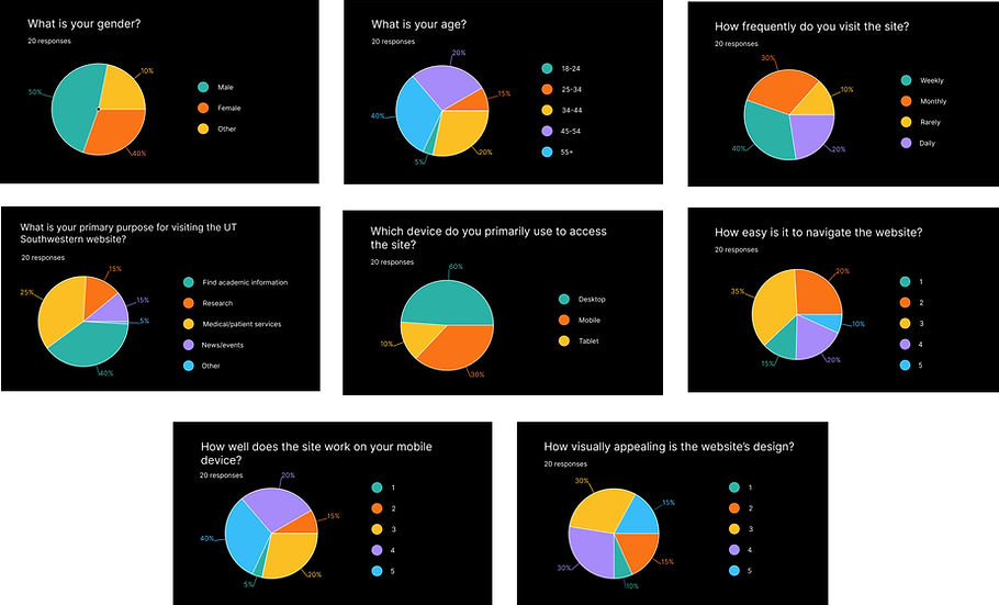
Quantitative research
Form
Google Survey
Responses
20
Gender
Male and Female
Qualitative research
We were able to interview 20 users, spanning from students, administrative staff, medical patients and faculty.
User Needs
Pain Points
Solutions
Users needed a streamlined, intuitive way to access academic programs, health services, department directories, and contact information. They also emphasized the need for consistent layouts, fast load times, and mobile-friendly interfaces.
-
Cluttered menus and redundant links
-
Inconsistent branding and layout templates
-
Poor mobile experience
-
Difficulty finding key information
-
Lack of accessibility features for users with disabilities
-
Developed streamlined navigation and sitemap
-
Designed mobile-responsive and accessible templates
-
Created high-contrast UI and screen-reader compatibility
-
Introduced reusable components for fast development and consistent branding
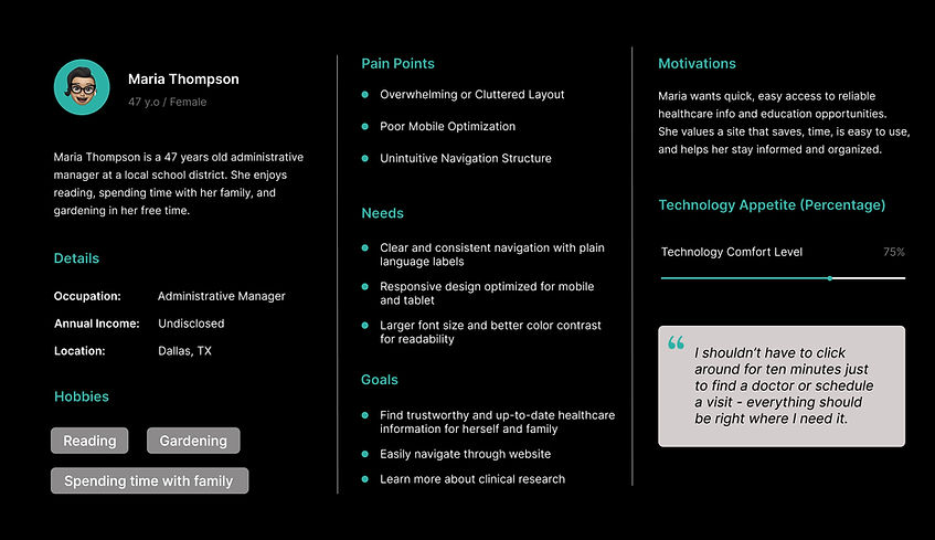
USER PERSONA
customer journey map
%20(1).jpg)
accESSIBILITY considerations
Accessibility was a fundamental aspect of the UT Southwestern redesign to ensure the website served all users effectively, including those with disabilities. Following WCAG compliant guidelines, I focused on creating an inclusive experience by addressing key areas such as color contrast, navigation, and semantic structure. The design incorporates high-contrast color schemes that meet recommended ratios, making text and interface elements easier to see for users with visual impairments. Semantic HTML and properly structured headings improve compatibility with screen readers, providing meaningful content hierarchy and clear navigation. Additionally, alt texts for images and descriptive labels for form fields were added to enhance understanding and usability.
Key Accessibility Actions Included
Implementing color contrast ratios that meet WCAG standards
Ensuring all interactive elements are accessible via keyboard
Using semantic HTML for screen reader support
Adding alt text for images and descriptive labels on forms
Designing clear typography and consistent layouts for readability
Avoiding flashing or moving elements that could trigger seizures or dizziness
Low-Fidelity Prototypes
Created initial wireframes in Figma:
-
Streamlined Navigation: Designed a simplified menu structure to ensure users can easily find key information
-
Consistent Layouts: Introduced standardized page templates to reduce confusion.
-
Accessibility Features: Added features such as screen reader compatibility and high-contrast mode
High-Fidelity Prototypes
Based on feedback, I refined the designs into high-fidelity prototypes:
-
Visual Design: Ensured consistency with UT Southwestern's branding, using modern typography and a clean layout.
-
Mobile Optimization: Designed responsive layouts for seamless user experience across devices.
-
Enhanced Functionality: Integrated dynamic search functionality and quick-access menus for frequently used resources.
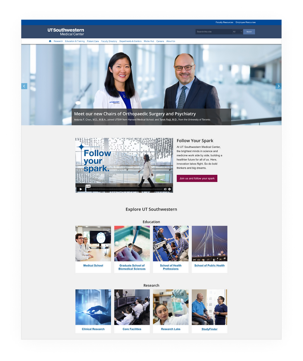
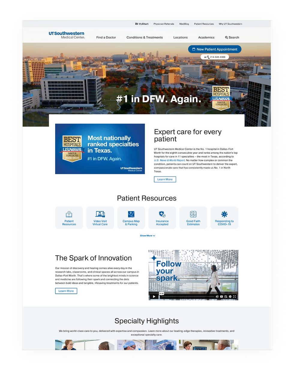
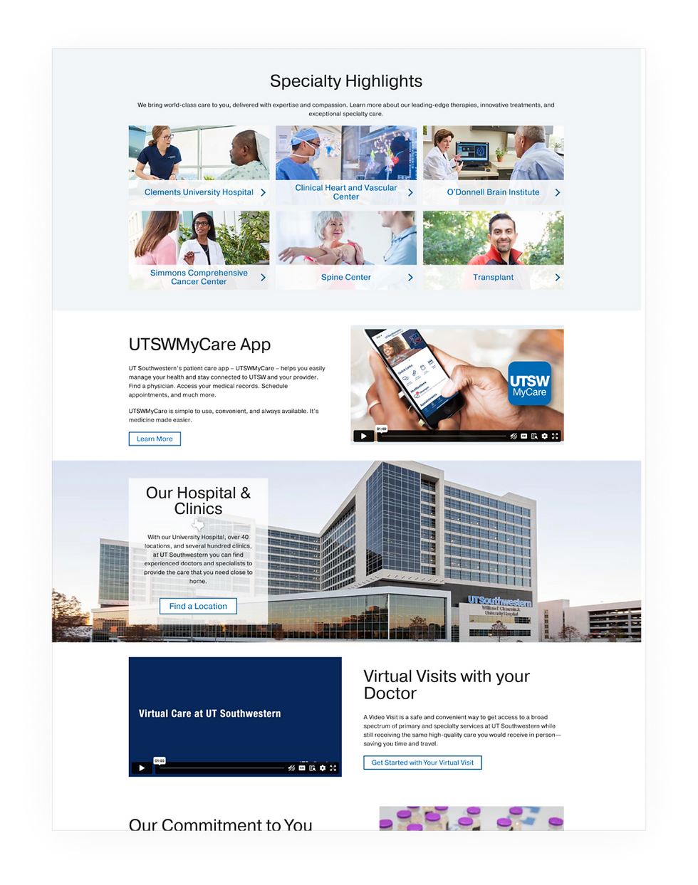
WEBSITE (.EDU AND .ORG)
MOBILE

Development Handoff & Implementation
I collaborated closely with developers to ensure a smooth transition from design to development. I created detailed design documentation and implemented key features like a reusable component library to standardize the interface and accelerate development. Additionally, I conducted regular design reviews during the development phase to ensure the final product aligned with the original design vision and met user needs.
Results & Impact
conclusion
The redesign of the UT Southwestern .edu and .org websites was a pivotal project that showcased the impact of prioritizing user-centered design. The project effectively met user expectations and business objectives through comprehensive research, iterative prototyping, and strong team collaboration. Key lessons included the importance of consistent user engagement to guide design decisions, iterative testing to refine the product, and close teamwork with developers to ensure seamless and accurate implementation.